Importing packages#
import matplotlib.pyplot as plt
import seaborn as sns
import pandas as pd
import numpy as np
Explore the dataset#
stroke_data.head()
| id | gender | age | hypertension | heart_disease | ever_married | work_type | Residence_type | avg_glucose_level | bmi | smoking_status | stroke | |
|---|---|---|---|---|---|---|---|---|---|---|---|---|
| 0 | 9046 | Male | 67.0 | 0 | 1 | Yes | Private | Urban | 228.69 | 36.6 | formerly smoked | 1 |
| 1 | 51676 | Female | 61.0 | 0 | 0 | Yes | Self-employed | Rural | 202.21 | NaN | never smoked | 1 |
| 2 | 31112 | Male | 80.0 | 0 | 1 | Yes | Private | Rural | 105.92 | 32.5 | never smoked | 1 |
| 3 | 60182 | Female | 49.0 | 0 | 0 | Yes | Private | Urban | 171.23 | 34.4 | smokes | 1 |
| 4 | 1665 | Female | 79.0 | 1 | 0 | Yes | Self-employed | Rural | 174.12 | 24.0 | never smoked | 1 |
A little bit of data preprocessing#
stroke_data.isnull().sum()
id                     0
gender                 0
age                    0
hypertension           0
heart_disease          0
ever_married           0
work_type              0
Residence_type         0
avg_glucose_level      0
bmi                  201
smoking_status         0
stroke                 0
dtype: int64
### getting the bmi mean for non-null values
bmi_mean = stroke_data[~stroke_data['bmi'].isna()]['bmi'].mean()
### filling the missing bmi values with the mean
na_index = stroke_data[stroke_data['bmi'].isna()].index
stroke_data.loc[na_index, 'bmi'] = bmi_mean
stroke_data.isnull().sum()
id                   0
gender               0
age                  0
hypertension         0
heart_disease        0
ever_married         0
work_type            0
Residence_type       0
avg_glucose_level    0
bmi                  0
smoking_status       0
stroke               0
dtype: int64
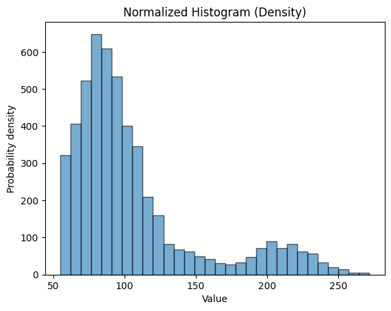
Matplotlib and histogram#
plt.hist(stroke_data.avg_glucose_level, bins=30, alpha=0.6, edgecolor='black')
plt.xlabel('Value')
plt.ylabel('Probability density')
plt.title('Normalized Histogram (Density)')
plt.show()
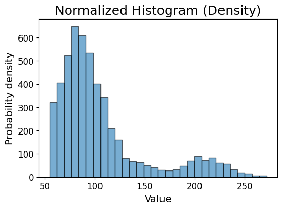
Changing font size and plot size#
plt.figure(figsize=(6, 4))
plt.hist(stroke_data.avg_glucose_level, bins=30, alpha=0.6, edgecolor='black')
plt.xlabel('Value', fontsize=14)
plt.ylabel('Probability density',fontsize=14)
plt.xticks(fontsize=12)
plt.yticks(fontsize=12)
plt.title('Normalized Histogram (Density)', fontsize=18)
plt.show()
Saving the plot#
plt.figure(figsize=(6, 4))
plt.hist(stroke_data.avg_glucose_level, bins=30, alpha=0.6, edgecolor='black')
plt.xlabel('Value', fontsize=14)
plt.ylabel('Probability density',fontsize=14)
plt.xticks(fontsize=12)
plt.yticks(fontsize=12)
# plt.grid(axis='y', alpha=0.75)
plt.title('Normalized Histogram (Density)', fontsize=18)
plt.savefig('avg_glucose_level_histogram.pdf', dpi=300, bbox_inches='tight')
plt.show()
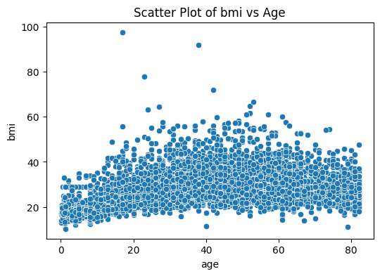
Seaborn and scatter plot#
plt.figure(figsize=(6, 4))
sns.scatterplot(data=stroke_data, x='age', y='bmi')
plt.title('Scatter Plot of bmi vs Age')
plt.show()
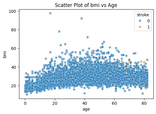
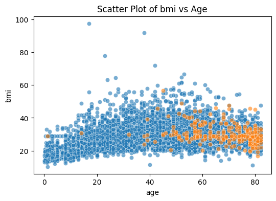
Color#
plt.figure(figsize=(6, 4))
sns.scatterplot(data=stroke_data, x='age', y='bmi', hue='stroke', alpha=0.6)
plt.title('Scatter Plot of bmi vs Age')
plt.show()
plt.figure(figsize=(6, 4))
sns.scatterplot(data=stroke_data[stroke_data['stroke']==0], x='age', y='bmi', alpha=0.6)
sns.scatterplot(data=stroke_data[stroke_data['stroke']==1], x='age', y='bmi', alpha=0.6)
plt.title('Scatter Plot of bmi vs Age')
plt.show()
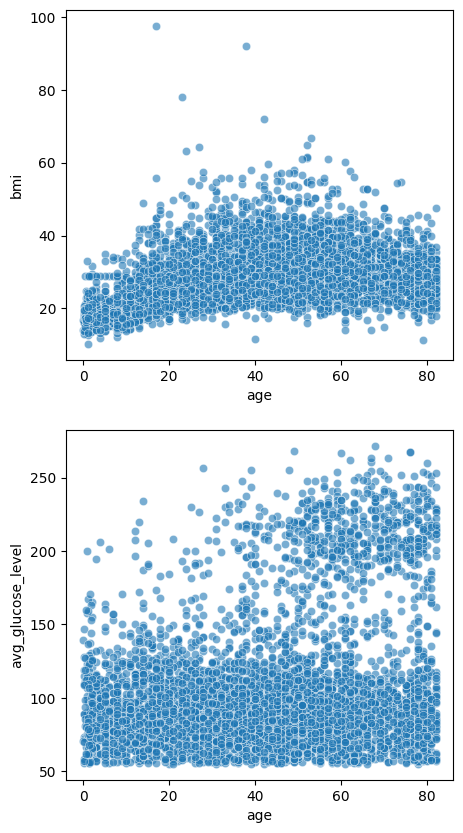
Multiple plots#
fig, axes = plt.subplots(2, 1, figsize=(5, 10))

sns.scatterplot(data=stroke_data, x='age', y='bmi', alpha=0.6, ax=axes[0])

sns.scatterplot(data=stroke_data, x='age', y='avg_glucose_level', alpha=0.6, ax=axes[1])

plt.show()
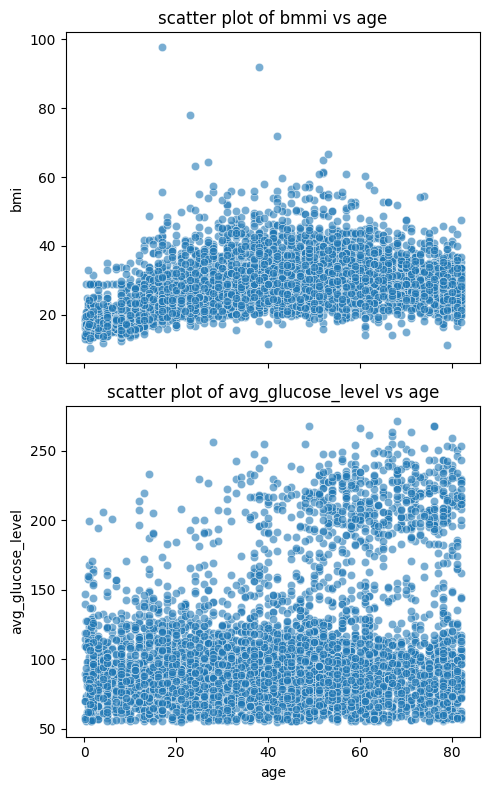
fig, axes = plt.subplots(2, 1, figsize=(5, 8), sharex=True)

sns.scatterplot(data=stroke_data, x='age', y='bmi', alpha=0.6, ax=axes[0])
axes[0].set_title('scatter plot of bmmi vs age')

sns.scatterplot(data=stroke_data, x='age', y='avg_glucose_level', alpha=0.6, ax=axes[1])
axes[1].set_title('scatter plot of avg_glucose_level vs age')

plt.tight_layout()
plt.show()
Seaborn and distribution visualization#
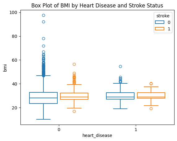
box plot#
sns.boxplot(data=stroke_data, x="heart_disease", y="bmi", hue="stroke", fill=False, gap=.1)
plt.title('Box Plot of BMI by Heart Disease and Stroke Status')
plt.show()
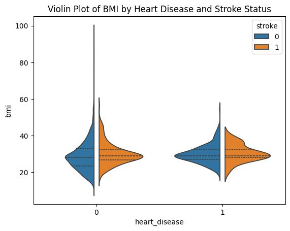
violin plot#
sns.violinplot(data=stroke_data, x="heart_disease", y="bmi", hue="stroke", split=True, gap=.1, inner="quart")
plt.title('Violin Plot of BMI by Heart Disease and Stroke Status')
plt.show()
Visualizing correlation#
stroke_data.head()
| id | gender | age | hypertension | heart_disease | ever_married | work_type | Residence_type | avg_glucose_level | bmi | smoking_status | stroke | |
|---|---|---|---|---|---|---|---|---|---|---|---|---|
| 0 | 9046 | Male | 67.0 | 0 | 1 | Yes | Private | Urban | 228.69 | 36.600000 | formerly smoked | 1 |
| 1 | 51676 | Female | 61.0 | 0 | 0 | Yes | Self-employed | Rural | 202.21 | 28.893237 | never smoked | 1 |
| 2 | 31112 | Male | 80.0 | 0 | 1 | Yes | Private | Rural | 105.92 | 32.500000 | never smoked | 1 |
| 3 | 60182 | Female | 49.0 | 0 | 0 | Yes | Private | Urban | 171.23 | 34.400000 | smokes | 1 |
| 4 | 1665 | Female | 79.0 | 1 | 0 | Yes | Self-employed | Rural | 174.12 | 24.000000 | never smoked | 1 |
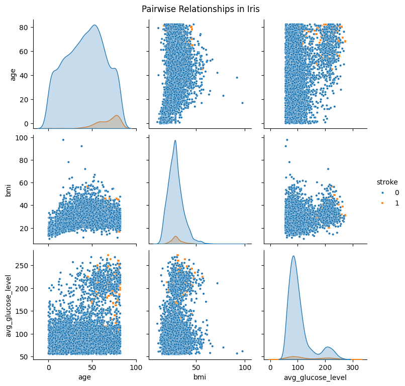
Pairplot#
df_pairplot = stroke_data[['age', 'bmi', 'avg_glucose_level', 'stroke']]
sns.pairplot(
    df_pairplot,
    hue="stroke",
    diag_kind="kde",
    markers=["o", "s"],plot_kws={'s': 10}
)
plt.suptitle("Pairwise Relationships in Iris", y =1.02)
plt.show()
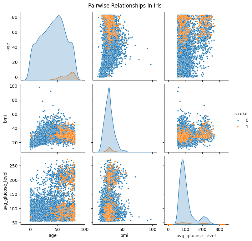
df_pairplot_reordered = pd.concat([df_pairplot[df_pairplot['stroke'] == 0],df_pairplot[df_pairplot['stroke'] == 1]]).reset_index(drop=True)
df_pairplot_reordered.head()
| age | bmi | avg_glucose_level | stroke | |
|---|---|---|---|---|
| 0 | 3.0 | 18.0 | 95.12 | 0 |
| 1 | 58.0 | 39.2 | 87.96 | 0 |
| 2 | 8.0 | 17.6 | 110.89 | 0 |
| 3 | 70.0 | 35.9 | 69.04 | 0 |
| 4 | 14.0 | 19.1 | 161.28 | 0 |
sns.pairplot(
    df_pairplot_reordered,
    hue="stroke",
    diag_kind="kde",
    markers=["o", "s"],plot_kws={'s': 10}
)
plt.suptitle("Pairwise Relationships in Iris", y =1.02)
plt.show()
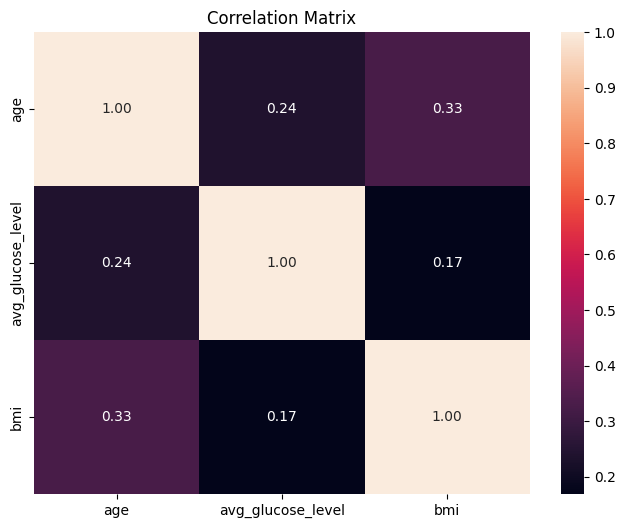
Heatmap#
stroke_numerical = stroke_data.select_dtypes(include=['float64'])
stroke_numerical.head()
| age | avg_glucose_level | bmi | |
|---|---|---|---|
| 0 | 67.0 | 228.69 | 36.600000 |
| 1 | 61.0 | 202.21 | 28.893237 |
| 2 | 80.0 | 105.92 | 32.500000 |
| 3 | 49.0 | 171.23 | 34.400000 |
| 4 | 79.0 | 174.12 | 24.000000 |
correlations_df = stroke_numerical.corr()
plt.figure(figsize=(8, 6))

sns.heatmap(
    correlations_df,
    annot=True,
    fmt=".2f",
)
plt.title("Correlation Matrix")
plt.show()
Linear regression and line plot#
from sklearn.linear_model import LinearRegression
from sklearn.model_selection import train_test_split
---------------------------------------------------------------------------
ModuleNotFoundError                       Traceback (most recent call last)
Cell In[28], line 1
----> 1 from sklearn.linear_model import LinearRegression
      2 from sklearn.model_selection import train_test_split

ModuleNotFoundError: No module named 'sklearn'
X_train, X_test, y_train, y_test =train_test_split(stroke_data['age'].values, stroke_data['bmi'].values, test_size=20, shuffle=False)
model = LinearRegression()

model.fit(X_train.reshape(-1, 1), y_train.reshape(-1, 1))
LinearRegression()In a Jupyter environment, please rerun this cell to show the HTML representation or trust the notebook.
On GitHub, the HTML representation is unable to render, please try loading this page with nbviewer.org.
LinearRegression()
stroke_data['age'].max(), stroke_data['age'].min()
(82.0, 0.08)
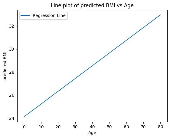
X_values = np.linspace(0,80,50)
predicted_bmi = model.predict(X_values.reshape(-1, 1))
plt.plot(X_values, predicted_bmi, label='Regression Line')
plt.xlabel('Age')
plt.ylabel('predicted BMI')
plt.title('Line plot of predicted BMI vs Age')
plt.legend()
plt.show()
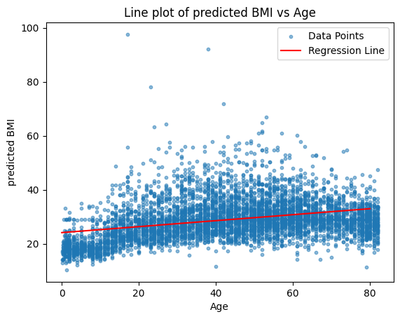
plt.scatter(stroke_data['age'], stroke_data['bmi'], label='Data Points', alpha=0.5, s= 10)
plt.plot(X_values, predicted_bmi, label='Regression Line', color='red')
plt.xlabel('Age')
plt.ylabel('predicted BMI')
plt.title('Line plot of predicted BMI vs Age')
plt.legend()
plt.show()
sns.regplot(data=stroke_data, x="age", y="bmi",scatter_kws={'s': 10},  line_kws={'color': 'red'})
plt.title('Line plot of predicted BMI vs Age')
plt.show()
